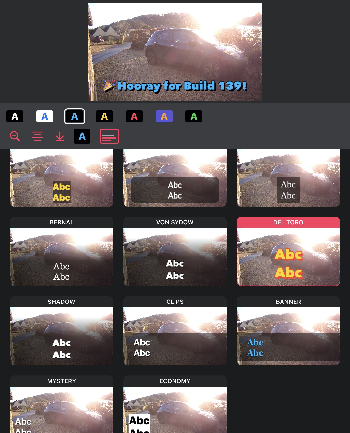
Styles are here!
We have shipped 1.0 Beta build 139 which adds tons of improvements and a whole new styling UI. You can download it free now as part of the beta program.
You can choose from one of the many themes, then tweak the text alignment, change the maximum lines and get snazzy by choosing from the colour schemes!
All of the themes use our Auto Size feature so you don’t have to worry about the font being too small to read when in a social feed, nor comically big — the clown shoes of subtitling!
We added new background styles so you can choose to have text-fitting backgrounds, backgrounds that extend to the edges, a “banner” across the screen, a gradient or even no background. We now have text outlines as well as hard and soft shadows — but all you need to do is pick a colour scheme.

A future release will include the “Pro” UI that allows creating custom themes with full control of fonts etc. but we think you’ll like what we have so far.
Note that the themes are subject to change — we will be tweaking the range available, the colour schemes and default alignments. Do let us know what you think so far.
Here are the details of what is in this release:
- Many style screen improvements, including list view on iPhone and grid view on iPad, and a live video preview
- Colour scheme selection — we provide a list of colours that work well together
- Subtitle padding calculation improvements, everything is nicely balanced now
- Subtitle vertical alignment options
- New background rendering options used in the themes: full-width backgrounds that don’t extend to top/bottom, vertical center support, improved gradient backgrounds, themes with no background, and line-length fitting background (see MYSTERY or ECONOMY)
- Outline support in themes (see VON SYDOW or DEL TORO)
- Hard and soft shadow support in themes (see CLIPS or DEL TORO)
- New fonts and font scale multipliers in themes
- Maximum line count selection (1, 2, 3 and unlimited)
- Improved transition to/from document browser and editor
